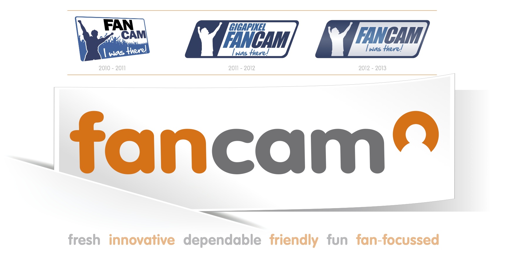
One would think that being an innovative tech company would make us adept to change, but it was surprisingly difficult to admit to ourselves that our brand did not really reflect who we are and what we do.
To be fair, our first logo was created in a couple of hours just before our first commercial project and the second one a few weeks later by taking a picture of founder James Taylor posing as a celebrating fan. “No typography buzz words were harmed in the creation of this brand.”
So after two year of posting James’s outlined figure on our activations around the world, it was time to bring in the professionals.
In what can best be described as an exercise in guided discovery, local firm Out of the Blue , with some creative input from our own senior designer Danie Roux, helped the founders loosen their grip on our old logo and move towards the light.
The end result is a crisper, cleaner, cooler and funkier look.
And we love it.
